Aestus Future
Redesigned the Aestus Future website through user research and iterative UX improvements to enhance clarity, simplify navigation, and increase user engagement.
My Role
UX Researcher, UX Designer
Feb-Mar 2022 (6 Weeks)
Timeline
Aestus Future is a fast-growing academic and career development company that provides accessible academic training programs and strategic career path navigation to emerging talents and transitioning professionals.
UNDERSTANDING THE PROBLEMS
There was significant traffic to the website, but it wasn't generating leads. We could see the users were interacting with some of the pages but were not compiled to enrol.
During my undergrad, my team and I worked on a previous version of this website. Last year, Aestus Future contacted me once more and asked me to redesign their websites to match their new brand image.
SOLUTION
Newly designed Aestus Future website features a clean and minimalist design that match with Aestus Future's new brand image, clear navigation that helps users quickly find essential information, more information building website legitimacy and messaging features that improve engagements.
Old
New

Empathy
USER INTERVIEW
Both interview and survey provided insightful feedback regarding what core problems we needed to solve.
As I was revamping the existing website, I decided to look for users who have visited our website before and understand what the staff feels about the website. I started by contacting people who visited the Aestus Website to get a sense of what resonated with them. Once I heard back, I created a survey to which there were 30 responses. At the same time, I connected with a few Aestus employees to hear their perspectives.
.png)
.png)
COMPETITIVE ANALYSIS + THE GAP
Aside from Aestus Future, there is no all-in-one platform that fulfils the academic and professional needs of undergraduate students

While analyzing different e-learning and career support websites, I realized that a well-designed UX can greatly influence training effectiveness. I listed some of the key success factors that I find within other websites:
-
Make navigation as easy and quick as possible
-
Adding more videos to the website can help users better understand the content to better promote products
-
Feature a clean and minimalist design
-
Make feedback, questions, and communication easy
-
Use visual indicators to guide website visitors
Define
DESIGN CHALLENGE
Pain Points --> Design Chanllenges
After the empathy phase, I identified key features that Aestus Future needed to prioritize:
Intuitive: The website needs clearer navigation indicators with a layout that helps users quickly find essential and relevant information.
Credibility: There is little information about the products and services sp a video introduction of the products, mentor information, and more detailed user testimonials will go a long way towards building legitimacy.
Engagement: Add messaging features to the website which will create a community and improve engagement.
Better UI design: The website does not match Aestus Future's new brand image and mission. It needs a clean, bright, and engaging design that encourages interaction.
SITE MAP
With a clear understanding of the challenges, I started to focus on redesigning the Home Page, Development Program Page and Student Dashboard. I created the Sitemap of the screens that I want to redesign and the relationships between them. This helped me get a better sense of how all the pieces fit together on the platform leading to a seamless experience for the user.
%20(3).png)
Ideate
WIRFRAME
With the site map ready, I could now develop the initial wireframes in Figma.

Next, I started internal testing with the product team and stakeholders to improve the wireframes. Based on their feedback, I changed my design and made three significant improvements:
-
Added program filters that made it easier for users to find specific options: Users mentioned that they want to search different programs based on schools and subject matters.
-
Combined the listing view with the calendar to showcase upcoming events on the student dashboard: Users were confused by the many CTAs on their screen and they were unsure of the next steps. The distraction also made it difficult to identify upcoming events.
-
Isolated chat function: Users didn't notice the chat box function, because there was too much information on the screen.


Adding a filter function

Combining the calendar view and list view
Floating Chat Box
Design
PROTOTYPE
Home Page
Overall Style
-
A more vibrant and engaging style that matches Aestus Future's new brand image and mission: a brighter future for students.
Old


New
.png)
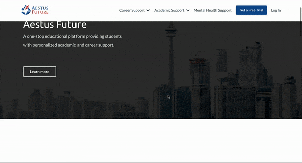
Hero Section
-
The CTA on the old hero section led to the About Us page which had little information, whereas now users are directed to a free trial which is more interactive
-
The new hero section also highlights engagement statistics to showcase past successes, inspiring reliability
-
The improved hero section has a highlighted main heading that clearly indicates what the website is for
-
It also includes a structured navigation bar to help users browse through information easily
Old

New
.png)
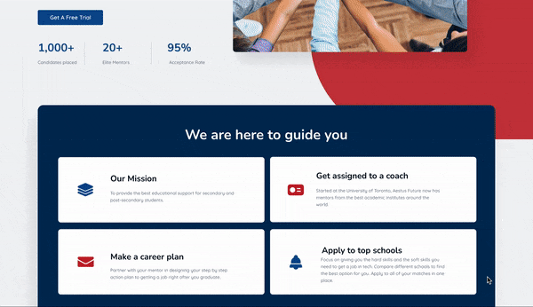
Features Section
-
The previous website section was confusing and didn't include detailed information about the various products and services
-
The improved feature section was much clearer and highlighted information about each product. More prevalent CTAs lead to specifications of each product making it easier for users to find what they are looking for
Old


New
.png)
Testimonial
-
To improve reliability, we added a more detailed review section including ratings, student placements, and photos
Old
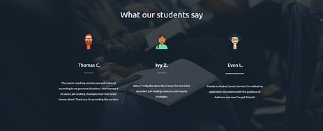
New
.png)
Newsletter
-
Moved incentives to the newsletter sign-up section to encourage user participation
Old

New
.png)
Solutions For Every Need!
This newly added section organizes essential information so that users can quickly identify what is relevant to them.
.png)
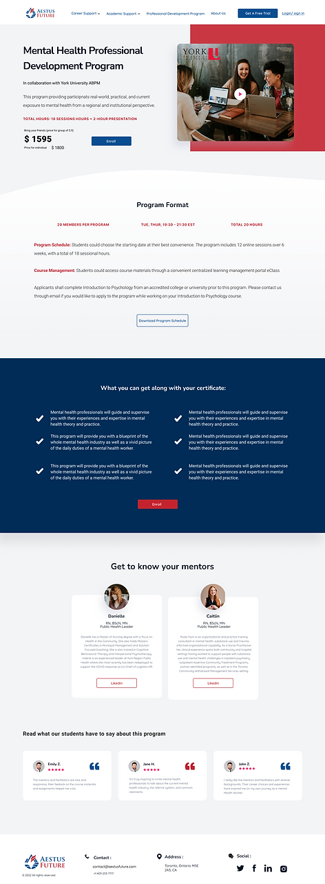
Landing Page
Professional Development
-
Added the university logos to attract more users to explore various programs
-
The landing page also includes a search and filter function making it easier to navigate listings
Old


New

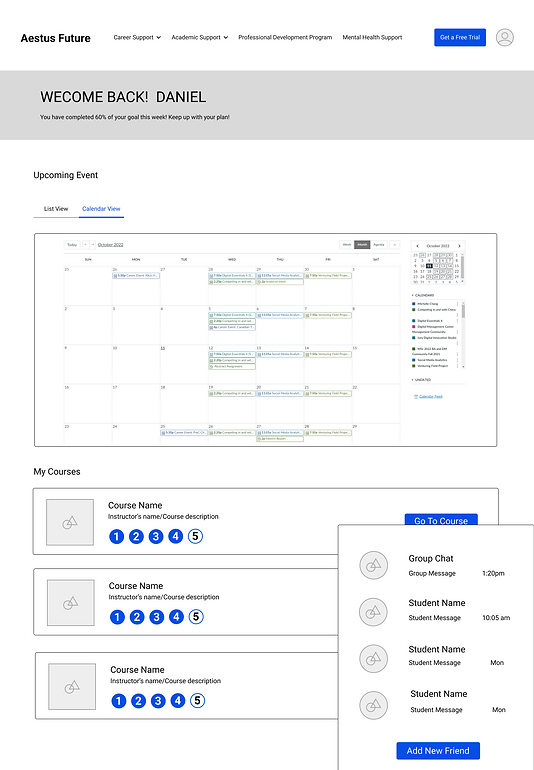
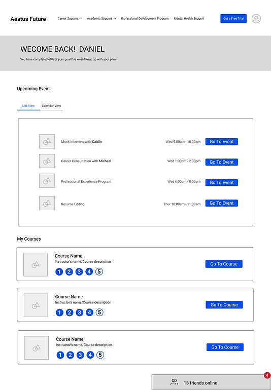
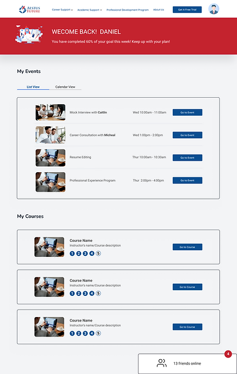
Student Dashboard
-
Users can view their event schedules and track course progress, increasing student motivation, and course completion rates
-
A social element is added to create a community that connects students that helps them engage with the program and each other

Testing
USABILITY TEST
Using Figma, I created the first version of the prototype based on the final wireframe. Next, I used user testing to check the flow of the website and to see how effective the CTAs were in guiding the user's decision-making.
Additional changes made based on more feedback
I redesigned the CTAs and included arrows that encouraged users to interact with it
.png)
The cart and bookmark CTAs under the section below were not relevant for users who only want to view the website as a guest. Instead, I replaced them with Enroll and Learn More buttons, improving the user flow.

.png)
The chat and outlined box design weren't consistent with the overall website style.

.png)

The Final Product
INTERACTIVE PROTOTYPE