AutoIdea.ai
AutoIdea.ai puts customers in control through personalized self-service experiences for automotive retail. My role was to design a platform that removed friction from purchasing finance and insurance products for dealership customers.
My Role
UX Researcher, UX Designer
May-July 2022 (12 Weeks)
Timeline
PROBLEM
Auto dealers misinterpreted the needs of consumers when it came to purchasing F&I Products
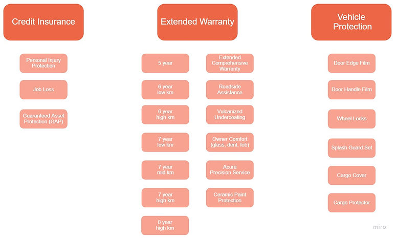
F&I (Finance & Insurance) includes ‘add-ons’ at point of purchase - extended warranty, tire/paint/fabric protection, finance ‘gap’ insurance, disability/job loss insurance
What the users said about purchasing F&I Products
.png)
SOLUTION
A tablet application that enhances F&I Products purchase experience by building the trust with customers, being transparent at every stage, providing customized offerings and helping customers make the best choices.
ON-BOARDING PROCESS
Conversational AI makes the onboarding process interactive and reduces customer stress


CREDIT APPLICATION
-
Eliminates paper and duplicate entries of data to simplify and streamline the application process
-
Data collected in this process is applied to create customized offerings for customers in real-time
F&I PRODUCTS SELECTION PROCESS
-
Self-service can adapt to the consumer’s level of understanding/interest with the right information at the right time
-
Customers can interact with visual data to make changes
-
The platform puts the customer in control and reduces stress and increases openness to information about suitable F&I products
-
The platform is easy to use and visually appealing, which surprises consumers who expect quite the opposite


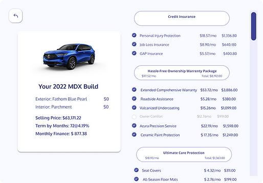
CHECKOUT PROCESS
-
Customers can view the full list of vehicle accessories, protection plans, and other F&I add-ons.
-
This continuous, intuitive experience shows the user exactly how the selected add-on will change their total and monthly payments
-
The platform offers flexibility in how much time the F&I process takes.
INTERACTIVE PROTOTYPE
.png)
Empathy
STAKEHOLDER INTERVIEWS
‘F&I’ drives the most profit for dealers
After breaking down the problem, I conducted a few stakeholder interviews that gave me valuable insights into user needs and AutoIdea.ai goals.
->Why is F&I importent for dealers? What is in F&I products?
F&I is a critical component of dealership revenues and profits. The F&I process generates about a quarter of dealerships’ gross profit across new and used vehicle sales. Some of the F&I products include:
SECONDARY RESEARCH
63% of car shoppers would be more likely to buy F&I products if they could learn about them before finalizing their vehicle purchase (Cox Automotive)
-
More than 60% of those polled say they believe F&I add-on products are just ways for stores to make more money
-
One third of respondents say they find lists of F&I product choices confusing
-
83% of those polled say they prefer to learn about F&I products beforehand and on their own
MARKET & COMPETITIVE ANALYSIS
I conducted market research and competitive analysis to get a sense of industry standards/ requirements to come up with innovative features for the final product. This would give AutoIdea.ai a competitive advantage, so we would go above and beyond customer needs/ expectations. I presented my research and recommendations to AutoIdea.ai's leaders as shown below:
80% of car sales may involve Digital Retail (DR) within the next five years
-
Covid-19 accelerated the adoption of online buying across all categories, including autos
-
Digital Retail is quickly becoming essential to dealers everywhere
-
Transparency for customers may facilitate a “race to the bottom”
... but the opposite may also be true:
– Many customers accept a no-haggle price or even pay a premium for pain-free buying
– Some customers are more receptive to purchasing more insurance and ancillary products, increasing profit per car deal
– Many dealers find they can cut staffing and costs with digital retail
– Sales reps are more productive, and commissions are lower at strong-digital retail store
While keeping the above statistic in mind, I analyzed a few platforms that use Computer-assisted interpreting (CAI) and chatbots. I also went on car dealer websites and I found that almost none of them had custom-built platforms just for F&I Products. This then became my opportunity for a solution.
%20(4).png)
USER INTERVIEWS
More than HALF of the participants would be more interested in buying F&I products if they have a clear understanding of what is included in the package
I interviewed 20 shoppers who had experience and interest in purchasing F&I Products

User Pain Points

I classified pain points into three main categories:
USER PERSONA
With the user's pain points in mind, we came up with two personas


Define
DESIGN CHALLENGE
Pain Points ---> Design Challenge
After the user research, I identified that AutoIdea.ai will need to prioritize the following features:
Trust - AutoIdea.ai must help dealers build trust with their customers by being fully transparent at every stage of the customer journey
Personalization - AutoIdea.ai must focus on a personalized customer experience by providing customized offerings and choices
Choice - AutoIdea.ai must help customers make the best choices, with access to the right information at the right time, all in one platform with a seamless digital experience
Efficient - AutoIdea.ai must include an intuitive interface that can be navigated easily, saving time for dealers and customers
MAKING DECISIONS
Increase F&I profits by using a Digital Self-Service Platform on Tablets
We spent some time experimenting with three different directions: Website, mobile, and tablet applications. In the end, we realized that a mobile app is too small to display all the information and a website is too costly considering in-store computer installation. We chose exclusively use Tablet applications due to the following reasons:
-
Tablets improve product visualization
-
They are easy to use and customers can use them anywhere (cars, couches)
-
They can gather customer information
-
Tablets will provide Interactive Digital Signs
-
They are cheaper compared to installing computers
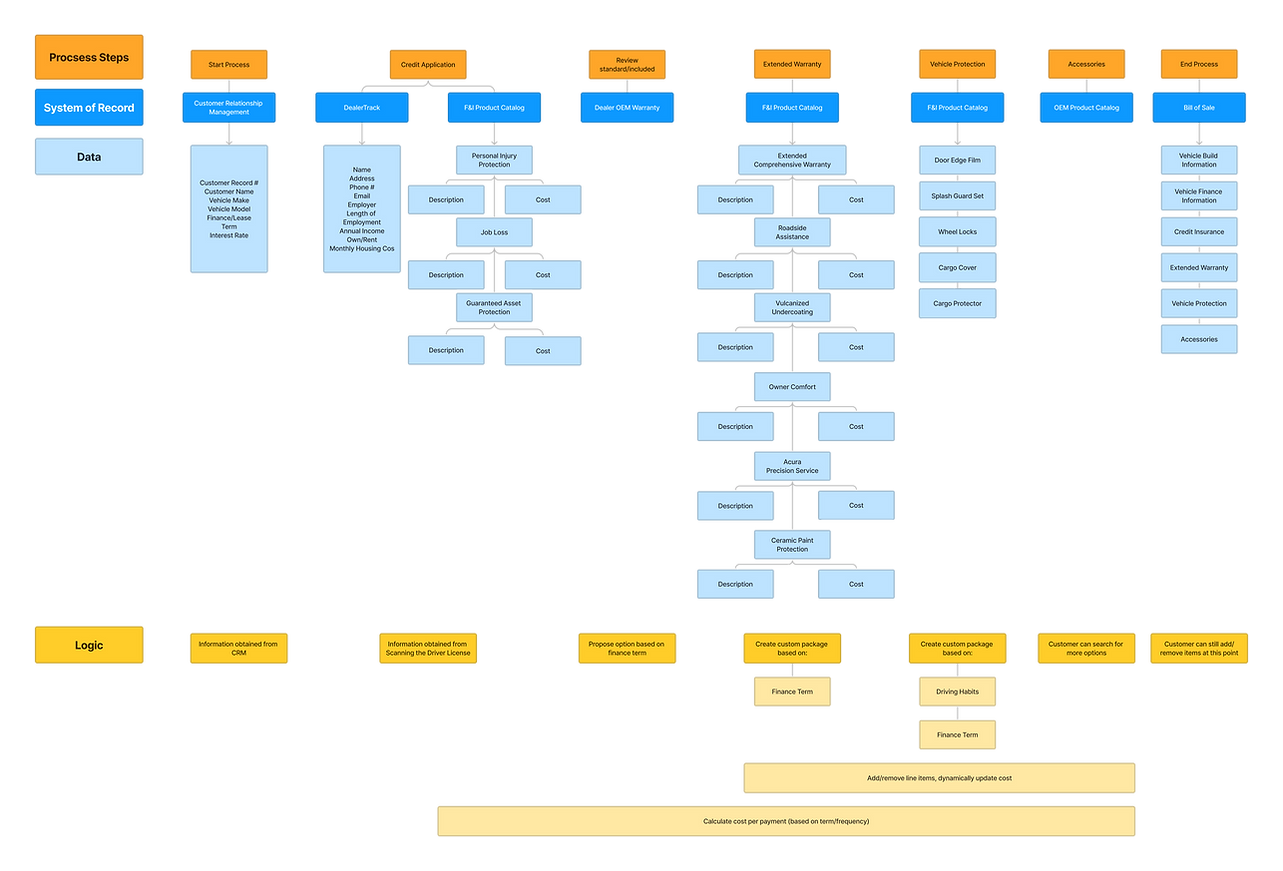
TASK FLOW CHART
F&I digital purchase process
An important part of my process was to create a task flow chart to organize the purchase process. The following chart also helped me determine which screens need to be created to enhance the purchasing experience.
%20(1).png)
Ideate
WIREFRAMES
Before I build out the actual prototypes, I tend to sketch out wireframes to get a sense of what layouts make sense and would be most convenient for users. For this project, in particular, I sketched some of the essential screens and continue to add features as I experimented with the layout.


Splash Screen
Qualifying Survey Screen
Product Screen
Shopping Cart Screen
With the user flow and sketches ready, the initial wireframes were developed in Balsamiq. We did internal testing to improve the wireframes. I consistently reiterated my design for 2 weeks and made two significant improvements:
-
Adding a stepper: users can go back to whichever step they prefer (based on test results, and findings)
-
Some users mentioned that while purchasing they didn't know which step they were at
-
Users were unsure as to how long it will take them to complete their purchase
-
-
Adding a Price Summary to each step: included a breakdown of the monthly payments per package
-
This increased price transparency
-
Users knew exactly how much and what they were paying for
-


Adding a Stepper
Adding a Price Summary
Design
PROTOTYPE
The first version of the prototype was designed in Figma

Testing Phase
USABILITY TEST
I conducted user testing using Maze which increased the efficiency of the platform flow and the CTAs, making it easier for users to make decisions. Maze is an online prototyping tool that syncs with Figma and measures how the test participants interact with the prototype. It helps to identify navigation patterns and where users have the most miss-clicks.
26 out of 30 participants completed the prototype. After reviewing the data and making corrections the completion rate reached 100%.
Some changes that we made based on feedback:
We made selecting a product more explicit and clear---Users were unaware that some of the products were pre-selected based on their chosen package

.png)
The pop-up windows didn't stand out, so I added a dark filter to the background. This way users were automatically directed to pertinent information with little distractions.

%20(1).png)
I placed the radio buttons to square checkboxes for the product list. Some users were uncertain whether they could select more than one option. They took the radio buttons to mean that they could pick only one out of the display options.
.png)
%20(4).png)
I changed the design of the title by replacing the oval outline with a rectangle. Some users clicked the title thinking that it was a button due to it's outline.
.png)
%20(13).png)
The Final Product
THE FINAL SCREENS
.png)
INTERACTIVE PROTOTYPE